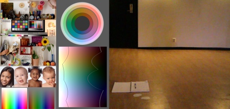
Making an image more (or less) colorful seems like an easy task. But in order to make the colorfulness respond as we expect it to, we need to take human perception into account. A nice way to evalute color-functions is to use gradients that appear to have the same intensity and colorfulness. There is also a sophisticated perceptual model called CIECAM02 that can be used for reference (here is a useful CIECAM02 photoshop plugin). Below is a small tool to compare ways of changing colorfulness. It’s the same source image processed in photoshop using different methods.
Compare for yourself
Hover mouse over the link captions below to compare, click to “lock” an image (hover response might initially be slow due to image loading). You can also compare in high-res.

For another comparison, check mark meyer’s blog it also has some scatter plots.
Hue/Saturation Dialog – Saturation
- This method has several “dead areas” where colorfulness cannot be increased (where any color-channel is 0 or 255), here are some examples:
- 004e4a (0,78,74)
- a2bdff (162,189,255)
- ffb7ad (255,183,173)
- Colors close to “dead areas” have a limited saturation span.
- Increasing colorfulness will also increase the perceived brightness of the colorful areas.
- Technically this seems to be a plain HSL (bi-hexcone) implementation.
Vibrance Dialog – Vibrance
- Vibrance increases colorfulness so that vivid colors are boosted less and faded colors are boosted more.
- Colors close to red are bosted less (the intent is to retain skin colors according to the manual).
- Using vibrance -100 will not fully desaturate and dark colors will be retained more than light ones.
- Calculation involves a HSV/HSL-like space*.
- An interesting side-effect of desaturating vibrance is that the colored parts of the image get a kind of S-curve applied to it, increasing the contrast of the desaturated material. This often looks quite good (see below), though it can cause some clipping of bright colors.
Hover mouse here to see Vibrance -100
Hover mouse here to see Grey (CIECAM02)

Vibrance Dialog – Saturation
- Overall, this algorithm is a very nice improvement over the older Hue/Saturation dialog, since it seems to be gamma corrected, and calculation is not done in HSV/HSL space*. Result is quite similar to CIECAM02.
- Colors are mixed to grey using about 28% 72% 0% (and then interpolated in linear RGB), which is close to perceptual standards.
- Bluish images might appear darker after desaturated (and using saturation -100 will discard all blue information).
- Saturation values are somewhat counter intuitive, if you saturate by -33 you have to saturate by 50 to get back to the original level. Though it is mathematically correct if you think in percentages; (1 – 0.33) * (1 + 0.5) is about one.
Channel Mixer Dialog
- Increasing colorfulness will also increase the perceived brightness of the colorful areas.
- Quite smooth and consistent, might be useful if you don’t have access to vibrance color controls.
- Mixer values (+120 -10 -10, -10 +120 -10, -10 -10 +120)
- Mixer values used for grey (+30 +60 +10 Monochrome)
* HSV/HSL color space is strikingly perceptually inconsistent, an extreme example is that it treats these two colors as having the same brightness:
0000FF (0,0,256)
FFFF00 (256,256,0)
Artifacts from the HSV/HSL transforms can be seen in the comparison tool, such as unsmooth gradients and increased noise (clearly visible in a still image from Canon D7 footage with a high ISO setting). Also note that, for most images these inconsistencies do not pose any major problem.