When plotting functions that grow rapidly such as exp and pow, it’s hard to get a sense of overview despite good scrolling and zooming tools. Why can’t we just graph it all?
The obvious answer is of course that there is way too much space, but isn’t it more fun to answer with another question:
-How can we warp that space to get as much useful information as possible?
Conceptually I figured that a warp could reveal the different types of functions, like this:
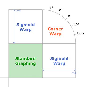
And… it works!
(note that you can click any screenshots to open the interactive lab in Mad Tea Lab)
Using the infinity graphing mode
It’s activated by just dragging in the top right corner, and drag the bottom left corner to enable negative infinity graphing (hold down alt-key for symmetry). If you double-click anywhere on the graph, the view will center on that point. The markers (gray lines) in the corners are just showing you basic functions:
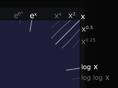
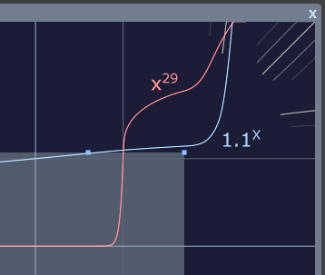
You can look at the visual similarity to see what type your function behaves like. For example, lets say way have 1.1^x and x^29. Even though x^29 crosses the gray exponential marker, it is clearly not as steep.
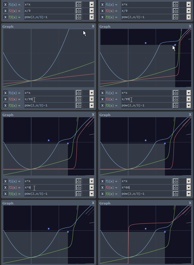
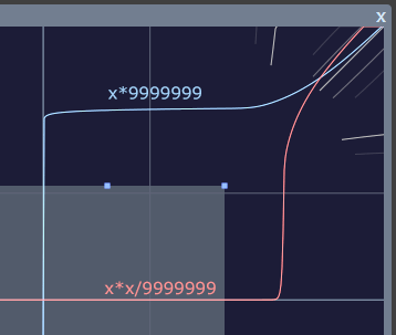
The example below shows how extreme scalings of linear and quadratic functions still sort themselves into the correct categories in the corner:
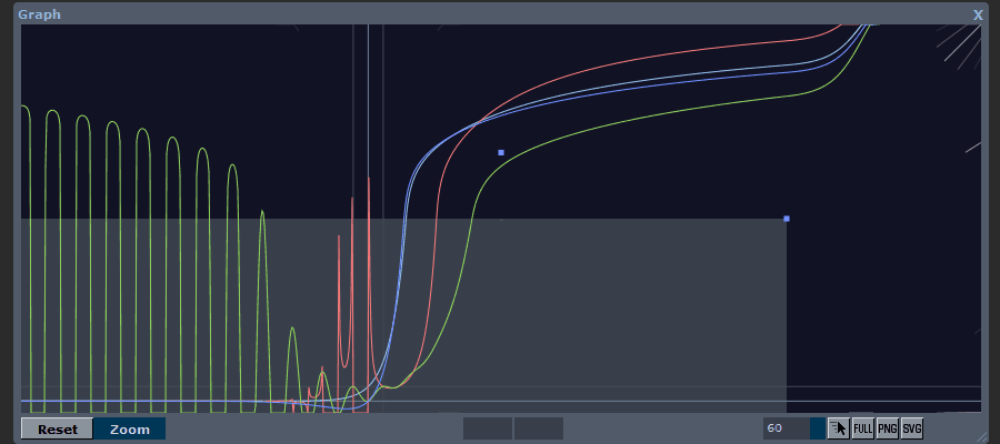
It could also be used to compare extreme functions and see intersections etc.
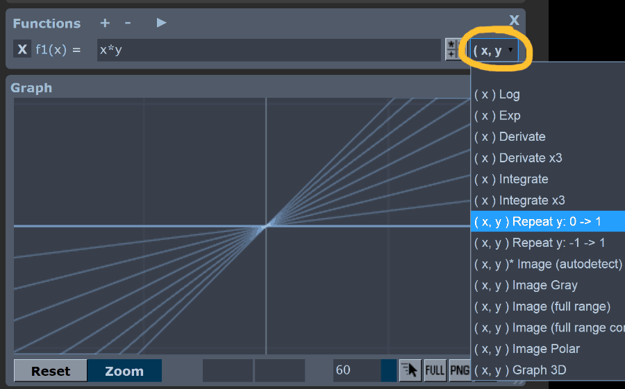
This feature also work with the relevant function rendering styles:
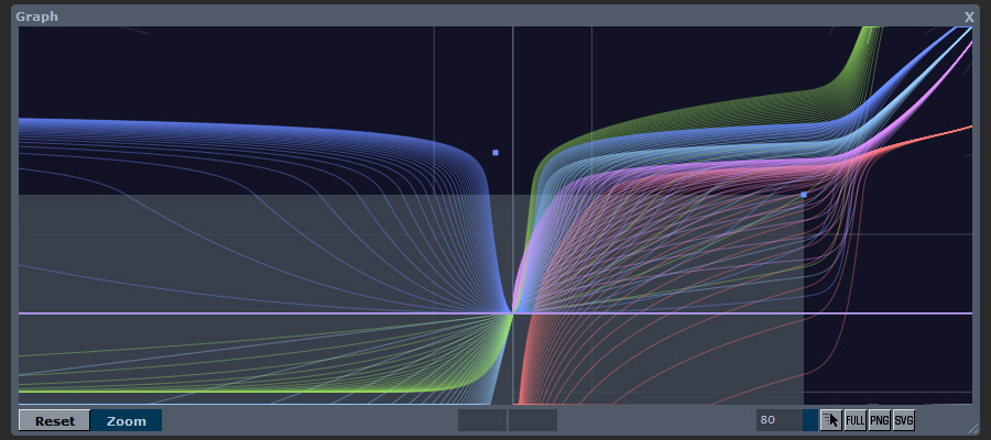
For instance, here I use the “Repeat y” plot to see how the infinity corner area gets filled by the different base functions:
Coolt!